(Tauri)Window Customized 하기

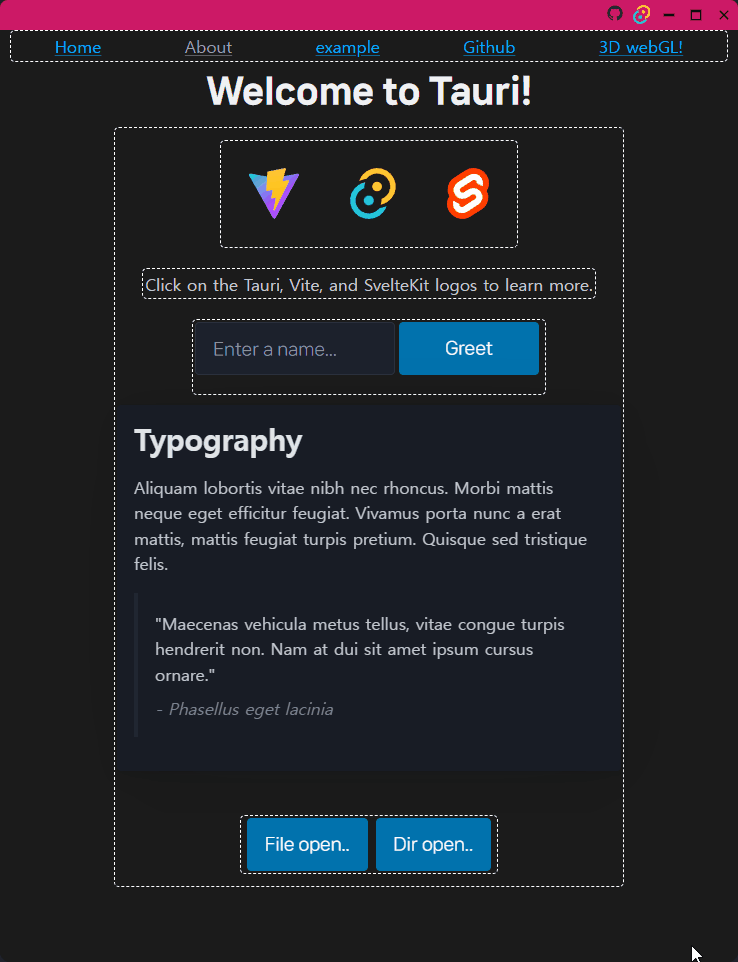
공식 문서에서 친절하게 설명이 되어 있는데 공식문서대로 따라하면 다음 문제점에 조우하게 된다.
titlebar부분의 위쪽 가장자리로 창 크기 조절(resize)이 거의 불가능해진다.- 창의 가장자리에
border-radius기능이 안 먹힌다.
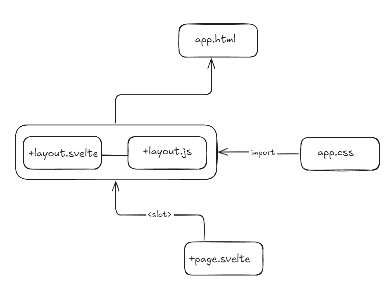
최근 재미삼아 만들고 있는 tauri app은 svelte + JS 기능을 활용한다. 앱의 구조는 아래와 같다.
1
2
3
4
5
6
7
8
9
10
11
12
13
14
<!--src/index.html-->
<!doctype html>
<html lang="en">
  <head>
    <meta charset="utf-8" />
    <link rel="icon" href="%sveltekit.assets%/favicon.png" />
    <meta name="viewport" content="width=device-width, initial-scale=1" />
    <title>Tauri + SvelteKit App</title>
    %sveltekit.head%
  </head>
  <body data-sveltekit-preload-data="hover">
    <div class="main">%sveltekit.body%</div>
  </body>
</html>
1
2
3
4
5
// src/+layout.js
export const prerender = true;
export const ssr = false;
import "@picocss/pico"
import "../app.css"
1
2
3
4
5
6
7
8
9
10
11
12
13
14
15
16
<script>
  import {appWindow} from "@tauri-apps/api/window"
</script>
<div>
  <div class = "row guideline" style = "margin-top : 30px;">
      <a href="/">Home</a>
      <a href="/about" class="secondary">About</a>
      <!-- <a href="https://github.com/" class="contrast">go Github</a> -->
      <a href="/datatable">example</a>
      <a on:click="{()=> {window.open('https://github.com')}}">Github</a>
      <a href="/webgl">3D webGL!</a>
  </div>
  <div>
    <slot><!-- optional fallback --></slot>
  </div>
</div>
+page.svelte나 app.css는 각자 원하는 내용을 채워 넣으면 된다.
해결방법
1. Resizable & Draggable Customized titlebar
1. +layout.svelte 수정하기
우선 +layout.svelte 파일에 아래 코드를 추가한다.
1
2
3
4
5
6
7
8
9
10
11
12
13
14
15
16
17
18
19
20
21
22
23
24
25
26
27
28
<div>
  <div data-tauri-resize-region class="titlebar">
    <div data-tauri-drag-region id="drag_region"></div>

    <div class="titlebar-icon" on:click={()=>{window.open("https://github.com")}}>
      <div id="go-github"></div>
    </div>
    <div class="titlebar-icon" on:click={()=>{window.open("https://tauri.app/ko/")}}>
      <div id="go-tauri"></div>
    </div>
    <div class="titlebar-button" id="titlebar-minimize" on:click={()=>{appWindow.minimize()}}>
      <img
        src="https://api.iconify.design/mdi:window-minimize.svg"
        alt="minimize"
      />
    </div>
    <div class="titlebar-button" id="titlebar-maximize" on:click={()=>{appWindow.maximize()}}>
      <img
        src="https://api.iconify.design/mdi:window-maximize.svg"
        alt="maximize"
      />
    </div>
    <div class="titlebar-button" id="titlebar-close" on:click={()=>{appWindow.close()}}>
      <img src="https://api.iconify.design/mdi:close.svg" alt="close" />
    </div>
  </div>

  <!-- 이 이후는 위에서 보여준 navigation 부분이다.-->
주목할 부분은 최상단의 두 줄의 코드다.
1
2
<div data-tauri-resize-region class="titlebar">
  <div data-tauri-drag-region id="drag_region"></div>
data-tauri-... 속성 종류를 확인하고 싶어서 공식문서에서 찾아보거나 구글링했지만 찾지 못했다. 발견한 내용을 기록하자면,
data-tauri-resize-region:titlebar과 같이 window 의 가장자리에 차지하는 component에 이 속성을 붙이면 창 크기 조절하게 된다.data-tauri-drag-region: 이 속성이 붙은 component는 window창 드래그가 된다.
2. app.css 수정하기
위 코드만 삽입한 것만으로 해결되면 좋겠지만 두 <div> 크기가 똑같다면, data-tauri-drag-region으로 인해 창 크기 조절이 안 된다.
그렇기 때문에 css로 조금 수정해주면 좋다.
1
2
3
4
5
6
7
8
9
10
11
12
13
14
15
16
17
18
19
20
21
22
23
24
25
26
27
28
29
30
31
.main {
  width: 100%;
  height: 100%;
  border-radius: 10px;
  background-color: #1b1b1b;
  overflow:auto;

  display: flex;
  flex-direction: column;
  justify-content: flex-start;
  align-items: center;
}

.titlebar {
  height: 30px;
  background: hsl(334,78%,45%);
  user-select: none;
  display: flex;
  justify-content: flex-end;
  position: fixed;
  top: 0;
  left: 0;
  right: 0;
  border-radius: 8px 8px 0 0;
}

#drag_region {
  margin : 5px 0 0 0; /*위 영역에 드래그할 영역을 남겨준다.*/
  width: 100%;
  height: 100%
}
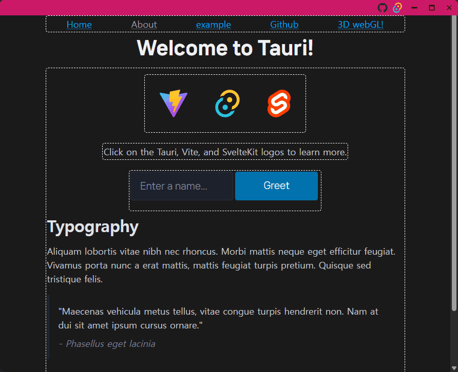
해결되면 아래와 같이 창 드래그와 창 크기 조절이 가능해진다. 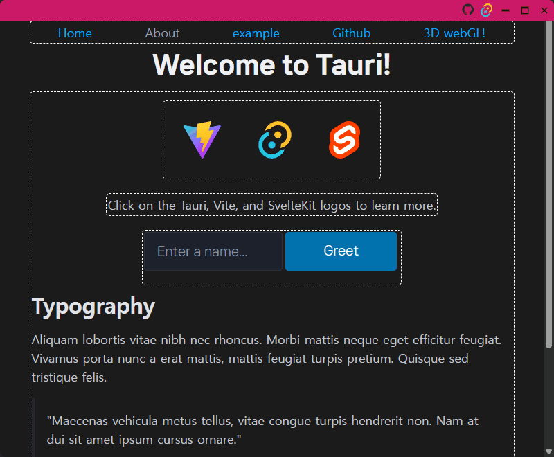
2. Apply Border-radius to Window
Svelte + JS(FE) 로 세팅된 tauri는 기본적으로 <body> 태그에 margin: 8px; 스타일이 적용되어 있다. 그리고 tauri.conf.json에 transparent: true로 설정하면 html창과 Window 창의 크기가 맞지 않기 때문에 <html>크기를 Window 창에 맞춰야 한다.
일단 같이 부모의 크기에 맞추는 width: 100%; height: 100%; 코드를 아래와 같이 추가한다.
1. app.css
1
2
3
4
5
6
7
8
9
10
11
12
13
14
15
16
17
18
19
20
21
22
23
24
25
26
27
28
29
30
31
32
33
34
35
36
37
38
39
40
41
--webkit-scrollbar {
  display: none; /*window 창 자체 스크롤을 지운다. */
}
html {
  width: 100%;
  height: 100%;
  margin: 0px;
  overflow: hidden; /*scroll 생략*/
  background-color: transparent; /*pico.css 적용시 이 코드 넣어야 가장자리가 둥글게 되는 효과를 줄 수 있다.*/
}

header {
  width: 100%;
}

section{
  overflow: auto; /*scroll 적용*/
  width: 100%;
  height: 100%;
  display: flex;
  justify-content: center;
}

body {
  width : 100%;
  height: 100%;
  margin : 0px;
  overflow: hidden; /*scroll 생략*/
}

.main {
  width: 100%;
  height: 100%;
  border-radius: 10px;
  background-color: #1b1b1b;

  display: flex;
  flex-direction: column;
  justify-content: flex-start;
  align-items: center;
}
만약 --webkit-scrollbar 코드 구문을 넣지 않으면 스크롤바가 titlebar에 가려지기도 하고 아니면 titlebar 옆에 배치되기도 한다.
2. +layout.svelte
1
2
3
4
5
6
7
8
9
10
11
12
13
14
15
16
17
18
19
20
21
22
23
24
25
26
27
28
29
30
31
32
33
34
35
36
37
38
39
40
41
<div data-tauri-resize-region class="titlebar">
  <div data-tauri-drag-region id="drag_region"></div>

  <div class="titlebar-icon" on:click={()=>{window.open("https://github.com")}}>
    <div id="go-github"></div>
  </div>
  <div class="titlebar-icon" on:click={()=>{window.open("https://tauri.app/ko/")}}>
    <div id="go-tauri"></div>
  </div>
  <div class="titlebar-button" id="titlebar-minimize" on:click={()=>{appWindow.minimize()}}>
    <img
      src="https://api.iconify.design/mdi:window-minimize.svg"
      alt="minimize"
    />
  </div>
  <div class="titlebar-button" id="titlebar-maximize" on:click={()=>{appWindow.maximize()}}>
    <img
      src="https://api.iconify.design/mdi:window-maximize.svg"
      alt="maximize"
    />
  </div>
  <div class="titlebar-button" id="titlebar-close" on:click={()=>{appWindow.close()}}>
    <img src="https://api.iconify.design/mdi:close.svg" alt="close" />
  </div>
</div>
<header>
  <div class = "row guideline" style = "margin-top : 30px;">
      <a href="/">Home</a>
      <a href="/about" class="secondary">About</a>
      <!-- <a href="https://github.com/" class="contrast">go Github</a> -->
      <a href="/datatable">example</a>
      <a on:click="{()=> {window.open('https://github.com')}}">Github</a>
      <a href="/webgl">3D webGL!</a>
  </div>
</header>
<section>
  <div>
    <slot><!-- optional fallback --></slot>
  </div>
</section>
<footer></footer>
고친결과는 아래와 같다. 아직 Tauri 기능이 많이 부족한 관계로 Electron과 Tauri를 병행하면서 미니프로젝트를 만들어보고 그 속도/메모리 성능을 비교해보는 것이 가장 나을 거 같다. ■