(AI)Deep Learning Intro
Kaggle에서 알려주는 Deep Learning 기본기
A Single Neuron
- create a **fully-connected** neural network architecture
- apply neural nets to two classic ML problems: **regression** and **classification**
- train neural nets with **stochastic gradient descent(SGD)**
- improve performance with **dropout**, **batch normalization**, and other techniques
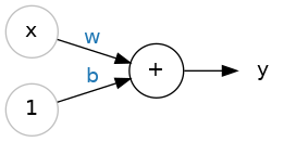
- A Single neuron : $y = wx + b$
- $w$ : weight (slope)
- $b$ : bias (y-intercept)
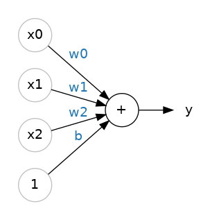
- Multiple Inputs : $y = w_0x_0 + w_1x_1 + w_2x_2+ b$
- 각각의 input에 weight가 붙고 있다.
캐글에서는 tensorflow를 기준으로 설명하고 있고 예제를 주피터 노트북으로 제공하고 있다.
:after border 추가할 경우 translateX(-border/2) translateY(-border/2) 해줘야 이동한다는 느낌이 안 든다.
Kaggle에서 참고할만한 기법들 모음
아래 글은 다음 kaggle 풀이방법에서 참고했습니다.
EDA | LightGBM & Optuna | 1.0644 | V1
Explore and run machine learning code with Kaggle Notebooks | Using data from Regression with an Insurance Dataset
결측치 한 눈에 보기
pd.DataFrame().info()나 sum(pd.DataFrame().isna()) 등으로 null 값 개수를 셀 수 있지만 null 분포를 확인할 수 없다. 그 때 사용하는 방법이다.
1
2
3
4
5
6
import matplotlib.pyplot as plt
import seaborn as sns
plt.figure(figsize = (15, 9))
plt.title("Visualizing null data distribution")
sns.heatmap(dataset.isnull(), cbar=False, yticklabels = False) #colorbar, ylabel 표시X cmap은 취향대로
plt.show()
수치형(연속형) 데이터 한 눈에 보기
수치형 데이터의 분포를 확인하는 용도로 사용하는 코드다. 구성은 다음과 같다.
feature만 분석하기feature-count(feature): 컬럼값 별 `countfeatureblox plot : IQR 확인
input-output분포분석 히스토그램처럼feature의 구간을 나누고 violin plot으로 분포도를 확인한다.
1
2
3
import matplotlib.pyplot as plt
import matplotlib.gridspec as gridspec
import seaborn as sns
1
2
3
4
5
6
7
8
9
10
11
12
13
14
15
16
17
18
19
20
21
22
23
24
25
26
27
28
29
30
31
32
33
34
35
36
37
38
39
#Create a color palette for the columns
palette = sns.color_palette("mako", len(numerical_cols))
color_dict = dict(zip(numerical_cols, palette))

# Create a grid of subplots for histograms, boxplots, and scatterplots/violin plots
fig = plt.figure(figsize=(30, 10 * len(numerical_cols)))
gs = gridspec.GridSpec(2* len(numerical_cols), 2, figure = fig)

df_binned = df.copy()

for i, col in enumerate(numerical_cols):
    if df[col].nunique() > 50 :
        discrete = False # Continuous variable
    else :
        discrete = True # discrete variable

    # Histogram
    ax_hist = fig.add_subplot(gs[2*i, 0])
    sns.histplot(df, x = col, fill=True, common_norm=False, alpha=0.6, linewidth=0.8, color = color_dict[col], ax=ax_hist, discrete=discrete)

    # Plot boxplot with the same unique color
    ax_box = fig.add_subplot(gs[2*i + 1, 0])
    sns.boxplot(data=df, x=col, ax=ax_box, color = color_dict[col])
    ax_box.set_title(f'{col} vs Target (Boxplot), fontsize = 14')
    sns.despine(ax=ax_box)

    # Conditional plot: violin plot or barplot based on unique values, fallback to scatterplot
    ax_conditional = fig.add_subplot(gs[2*i:2*i+2, 1]) # Merges 2 rows
    if df[col].nunique() <= 10 :
        sns.violinplot(data=df, x=col, y='Premium Amount', ax=ax_conditional, color = color_dict[col], alpha=0.6)
        ax_conditional.set_title(f'{col} vs Premium Amount (Violin Plot)', fontsize = 14)
    else :
        df_binned['Binned Column'] = pd.cut(df[col], bins=10)
        sns.barplot(data=df_binned, x=col, y='Premium Amount', ax=ax_conditional, color = color_dict[col])
        ax_conditional.set_title(f'{col} vs Premium Amount (Violin Plot)', fontsize = 14)
        ax_conditional.set_xlabel(f'{col} Binned', fontsize = 12)

plt.tight_layout()
plt.show()
위 코드에서 1.2 blox plot부분만 제거하고 범주형-실수형 데이터 분포 해석하는데 사용해도 문제가 없다.
Pipeline 사용하기
파이프라인은 스크립트나 엑셀 매크로처럼 전처리, 모델 학습 등등의 작업을 자동화해주는 기능이다. 수학시간 때 배운 함수 설명하는 다이어그램을 생각하면 더욱 편하다.
예를 들어, 다음과 같은 파이프라인이 있다고 하자.
1
from sklearn.pipeline import Pipeline
1
2
3
4
5
6
7
8
9
10
11
12
numerical_pipeline = Pipeline(steps=[
	('imputer', SimpleImputer(strategy='median')),
	('scaler', StandardScaler()) # Scale numerical features
])

categorical_pipeline = Pipeline(steps=[
	('imputer', SimpleImputer(strategy='constant', fill_value='Unknown')),
	('onehot', OneHotEncoder(handle_unknown='ignore'))
])

df[numerical_columns] = numerical_pipeline.fit_transform(df[numerical_columns])
df[categorical_columns] = numerical_pipeline.fit_transform(df[categorical_columns])
This post is licensed under CC BY 4.0 by the author.